
How to Read the Precious Metal Charts
Key Takeaways
- Gold and silver price charts help investors track price movements and identify trends to help them make investment decisions.
- The types of precious metal charts are line, bar, and candlestick charts. Candlestick charts offer the most detailed and useful insights.
- Investing in precious metals like gold requires monitoring past and current performance to observe trends, predict future price movements, and prepare to make a move.
For many people hoping to get into precious metals, charts can feel like a barrier at first. They often look intimidating because of the unfamiliar chart style and the amount of information squeezed into a small space. And then, there’s the unfamiliar jargon like bullish divergence, resistance, and support, which require studying to understand them.
All these elements make investing in precious metals appear complicated and a reserve for a few. However, that’s not true. Yeah, there’s a bit of a learning curve at first, but once it clicks, reading charts becomes second nature. So, let’s unpack what the charts are actually showing, and how you can start pulling useful insights from them. It’s easier than it looks!
What are Gold and Silver Price Charts?
The price fluctuations of gold and silver over time are captured in charts. The horizontal axis shows time in minutes, days, months, and years, while the vertical axis captures price levels.
By studying precious metal charts, you can see how a particular metal performed in a given period and compare it with its performance in another period. For example, you can compare gold prices 6 months ago to the gold rate in the last week to see the price trend and anticipate future market movements.
Types of Gold and Silver Price Charts
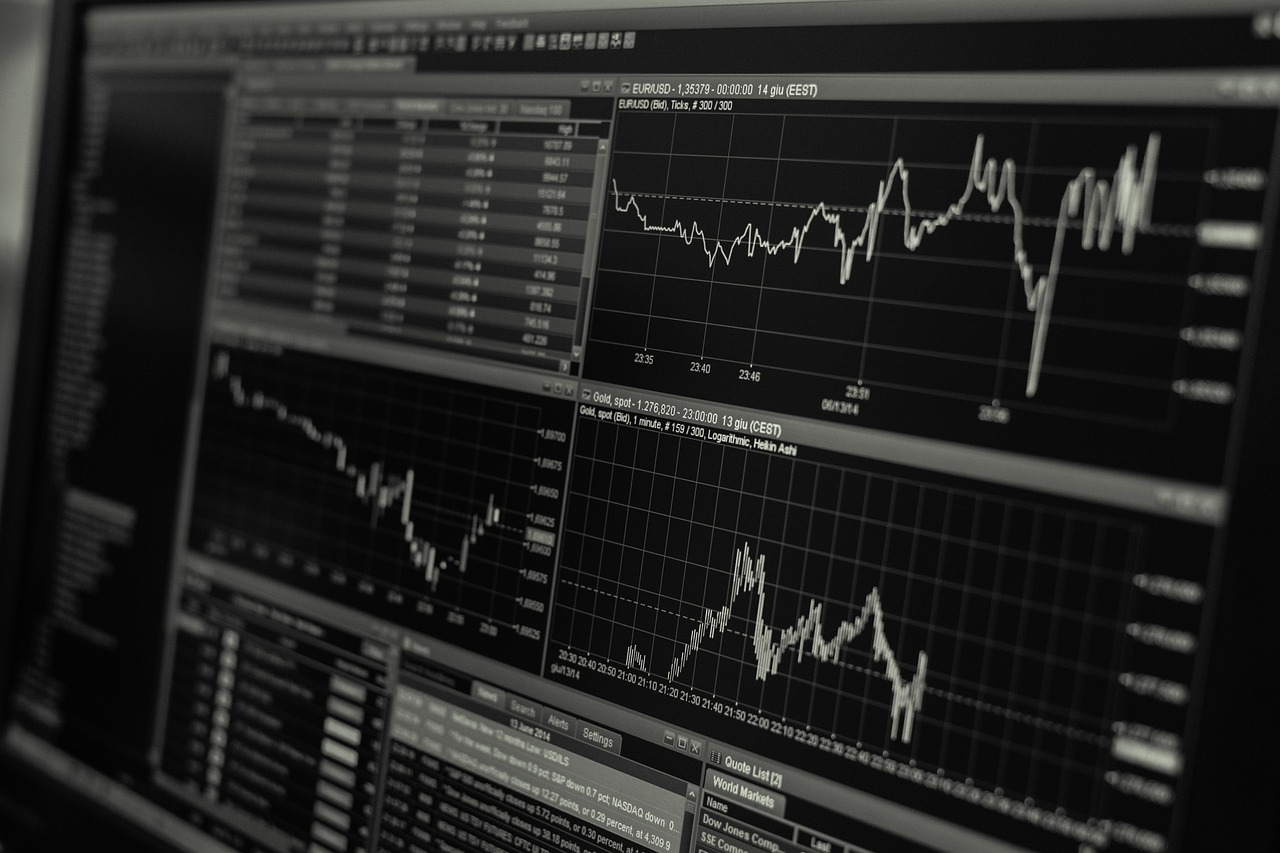
What kinds of charts are you likely to come across when researching the price of gold or silver? Here are the main types:
- Line Charts: They link closing prices together and are great for spotting overall trends.
- Bar Charts: More complex than line charts, bar charts show the high, low, opening, and closing prices. They’re compact and can be difficult to read at a glance.
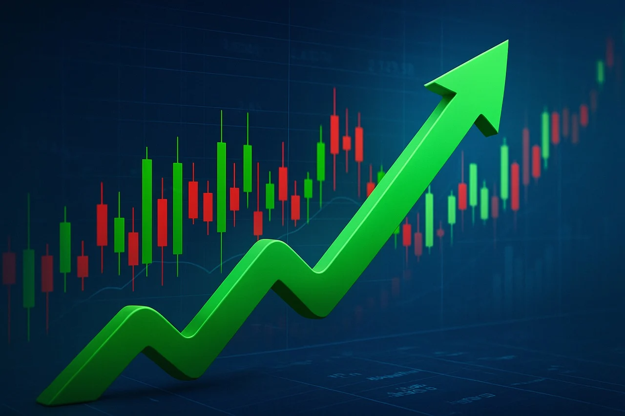
- Candlestick Charts: This kind is the most popular. It features “candles” that show the opening, closing, highest, and lowest prices recorded in a given period, say a day or week. Red candles show that the price closed lower, while green candles indicate the price closed higher.
Candlestick charts are most preferred because they show trends and price movement at a glance, allowing investors to make quick decisions.
Understanding Market Trends
When reading gold and silver price charts, price trends are one of the most important things to observe because they show the overall market direction. The types of trends you’re likely to come across include:
- Bullish (Uptrend): It shows that prices are rising consistently.
- Bearish (Downtrend): It shows that prices are falling.
- Sideways Trend: It indicates that prices are moving up and down within a narrow range, and there’s no clear direction.
Take note of these price movements to see whether it’s time to buy, sell, or hold on to your metals.
Other Terms Used to Interpret Gold and Silver Price Charts
- Support: This is the price level at which the downward trend stops, and the price starts to bounce back due to increased demand as more buyers come in.
- Resistance: This is the ceiling, where prices hit and have a hard time going higher due to increased selling pressure, as more sellers enter the market.
- Moving Averages: Moving averages filter out short-term price fluctuations to make trends stand out more clearly, making it easier to compare long-term price history, like gold prices from six months ago with the gold rate in the last week, without getting distracted by random short-term jumps or dips.
- Relative Strength Index (RSI): The RSI is a tool that helps you see if a metal is overbought (70 and above) or oversold (30 and below). Use this figure to spot when a price move might be about to turn around.
The Role of Trading Volumes
Trade volume is an important element to analyze when studying gold and silver price charts. A higher bar shows a higher trading volume, and vice versa.
A high volume at a time when the price is going up suggests stronger demand, while a high volume when the price is declining suggests a strong selling pressure. If the volume is low, there may be uncertainty in the market.
Use volume to determine if the price trend is strong or weak, to plan your next move.
How External Factors Affect Precious Metals
We’ve mentioned external factors when referring to price trends, but what are they? They’re macroeconomic factors that affect prices in general. They include inflation rates, interest rates, geopolitical events, and currency strength.
When external factors have adversely affected most financial instruments, precious metals often do the opposite. They typically rise when the economy is uncertain, which is why they’re considered safe-haven assets. If you anticipate an upcoming economic shakeup, investing in precious metals can help safeguard your wealth better than other instruments can.
Build a Consistent Strategy
Mastering how to read gold and silver price charts requires consistency. The more you interact with them, the deeper your understanding becomes. To practice reading and interpreting market data from price charts, dip your feet in the market by investing in gold or silver.
Explore First National Bullion’s vast inventory online or in person at our physical stores in Arizona and California. Our prices are competitive, and you get free shipping for orders of $199+. Also, learn about our storage solutions.
FAQs
What precious metal chart type is most suitable for beginners?
Line graphs are the easiest charts to study as a beginner. However, candlestick charts offer more insights. Put in the time to learn them, and they’ll serve you well in the long run.
How-to-Read-the-Precious-Metal-Charts
Global events like central banks’ fiscal policies, political instability, and economic crisis influence the prices of precious metals because during periods of uncertainty, investors turn to gold and silver as dependable stores of value. The increased demand causes prices to go up.
How long does it take to master reading price charts?
Expect your skills to improve gradually with practice. Beginners typically grasp the basics in a few weeks, but becoming a pro can take months or even years of consistent learning and application in real-life scenarios.